
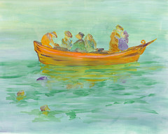
"The Lifeboat"
Acrylic on paper 8x10
Acrylic on paper 8x10
I put some thought into the composition and color selection before beginning the painting. I used the rule of thirds to place the lifeboat further up on the page and slightly to the right. I also added the discarded items in the water at the bottom left to bring the viewer into the painting.
The colors were selected as a triad. The aqua blues, oranges, and purples were selected before I began the painting. Aside from the these three colors, a little mixing white was used to lighten and soften.
I have not done many paintings in this soft, unfocused style. I hope it adds to the feeling of the piece.
Share this post: |
|
8 COMMENTS - Click here to leave YOURS!:
It gives and impression of quietness and pleasure. Drifting happily ;-)
Lovely painting !
Nice job, I like the look of it!
It has the feeling of watercolor. . .soft and soothing comes to mind. Perfect for the topic.
Great job!
Robin, it is BEAUTIFUL! Your intentions were absolutely realized. The colors are beautiful, and the scale and placement are spot-on. I wish you could offer me art lessons!
Renee :)
Robin, it is BEAUTIFUL! Your intentions were absolutely realized. The colors are beautiful, and the scale and placement are spot-on. I wish you could offer me art lessons!
Renee :)
oh wow!! I love this piece...wonderful work and thank you for popping by!!!!
Really lovely and peaceful!
This is a great piece. I do like the color selection - it is quite tranquil, which fits the concept - as drifting seems to be such a tranquil thing.
-catania
Post a Comment